


About that Forest
Analysis is guesswork. The challenge to an analyst is to be a good guesser.

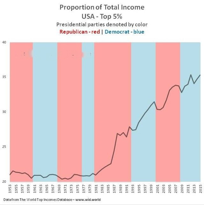
This is the second of two related posts. Seeing the Forest, not the Trees. If you read that first, this one will make a lot more sense. Here is the chart I used.
In the prior essay, I said, “However, ignoring ‘trees’ individually and looking at the ‘forest’ in this light, what does this graph say to you? What does it mean? Anything?”
One of you wrote and said abandoning the “gold standard” was the cause of the shift. In my mind, this is unlikely as that was in 1971 during Richard Nixon’s first term, and the upward surge only became truly noticeable in Ronald Reagan’s second term, more than a decade later, when it was most dramatic, followed by the fairly “flat” period of George H.W. Bush.
Three others summed it up in two words, “Ronald Reagan”. I understand. People associated him with increased income for the upper-class. When I first put this chart together in 2014 and shared it with my editor at Barron’s, he said the same thing immediately. What did it initially say to me?
It tells me that the party identification or the ideological identification of the governing President made no difference at all to the proportion of income received by the top 5%.
There is no correlation with Presidential party ID, none, nada, zilch. If there were, you would be looking at a roller coaster, not a flat plain leading up to a mountainside. Either that, or Presidents Clinton and Obama were secret admirers of President Reagan.
But did I see anything else? Yes. Understand that the numbers have a “lag time”. The events that lead to them do not immediately change them. Major shifts “unfold”, no matter how “sudden” they may seem to you and me when we feel the impact.
What did I see? I won’t take too much time with this. It is easy enough to give you the idea. I also see the death of China’s Mao Zedong in 1976, the struggle for power that followed that, then the period of Deng Xiaoping’s leadership from 1978 through 1989, and the opening of China to partial economic freedom (Socialism with Chinese characteristics).
Meanwhile, thousands of miles or kilometers from Beijing in Moscow, a new General Secretary of the Communist Party of the Soviet Union was announced, Mikhail Gorbachev. He was not well-known to the rest of us in 1985, but he became exceptionally well-known as his liberalization of the Soviet Union led to its dissolution in December of 1991. This was followed by what can simply be called the end of the Cold War.
Enough. You get the idea. Half the world opened up to outside investment, and the people with money to make a difference showed up, dreaming of huge markets and huge profits. That was a substantial factor in my mind. The only one? Of course not, life is way more complex than that. The most important one? No, not necessarily.
The US$ played a part, and Ronald Reagan played a part, but it was a big stage, even bigger today. As humans, we love simple explanations for important events, but on the global stage today, simplicity is rare. Don’t waste a good graph, no matter how “simple” it may seem at first.
With that in mind…
A special note to end. I created that simple chart a decade ago for an article I was going to submit to Barron’s as a commentary on the work of a French economist, Thomas Piketty. It was not the artwork for the article, but it was included in my draft. I forgot about it in the rush of other business and, when I finally got around to submitting it, Dr. Piketty had already had his “15 minutes of fame” and was no longer of interest to my editor! If it had, the simple one here would never have been used. An artist would have redone it.
But it gives me an opportunity to show you a trick that can sometimes open your mind to different thoughts. I take a graph and turn it upside-down or, in this case, just a quarter turn. Take a look. Do this with any graph. Once in a while, it shifts your focus and shares something new.
