Seeing the Forest, not the Trees
It ain't sudoku or kakuro, but it's a puzzle and a challenge!

This is an exercise in analysis. I will not deal with wealth here, but focus on income, something easier to quantify, and typically more stable. I will concern myself only with the US. The statistics on US income are as solid as you are likely to find. Since the same trend can be found among the top 1%, the top 5%, and the top 10% of income-earners, I will use the middle group, the 5%, as my example today.
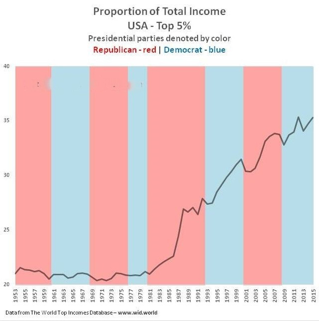
Below is a graph of the percentage of total income in the US earned by the 5% over a sixty-year period beginning in 1953 and the inauguration of President Eisenhower through and including 2012, the end of President Obama’s first term.
The time period reflects the data available at the time I first created the graph in 2014. Updating isn’t necessary for my purpose here. Red columns are for Republican presidencies and blue for Democrats.
The first 28 years, when the top 5% received just over 20% of the income, represent six Presidents (Eisenhower, Kennedy, Johnson, Nixon, Ford, and Carter), three Democrats and three Republicans.
The remaining 32 years represent five Presidents (Reagan, GHW Bush, Clinton, GW Bush, and Obama), three Republicans and two Democrats.
Some were generally judged to be conservative (e.g., Reagan), some moderate (e.g., Carter), and some liberal (e.g., Obama).
However, ignoring “ trees” individually and looking at the “forest” in this light, what does this graph say to you? What does it mean? Anything?
This is Monday, 16 June. I will be back on Wednesday, 18 June with my own comments. You are welcome to add your own here (open to everyone) or message me. Note: I have no tolerance for personal or ideological attacks. There are other sites for that.
I just want you to think, what caused this dramatic change? Something must have happened, or not? Please share. There is no “right answer” that can be proven, but there can be good ones. Think about it. See you on Wednesday!